R. Crumb
From Underground to GENESIS
Robert Crumb’s accomplishments and popularity in comic book history are hard to match, and his reputation as being highly opinionated is almost as well known. However, he turned out to be one of the most cooperative and pleasant creators I have ever worked with. He knew exactly what he wanted and wasted no time in letting me know. Perhaps that may rub some designers the wrong way, though when compared to the alternative, his direct nature was a breath of fresh air.
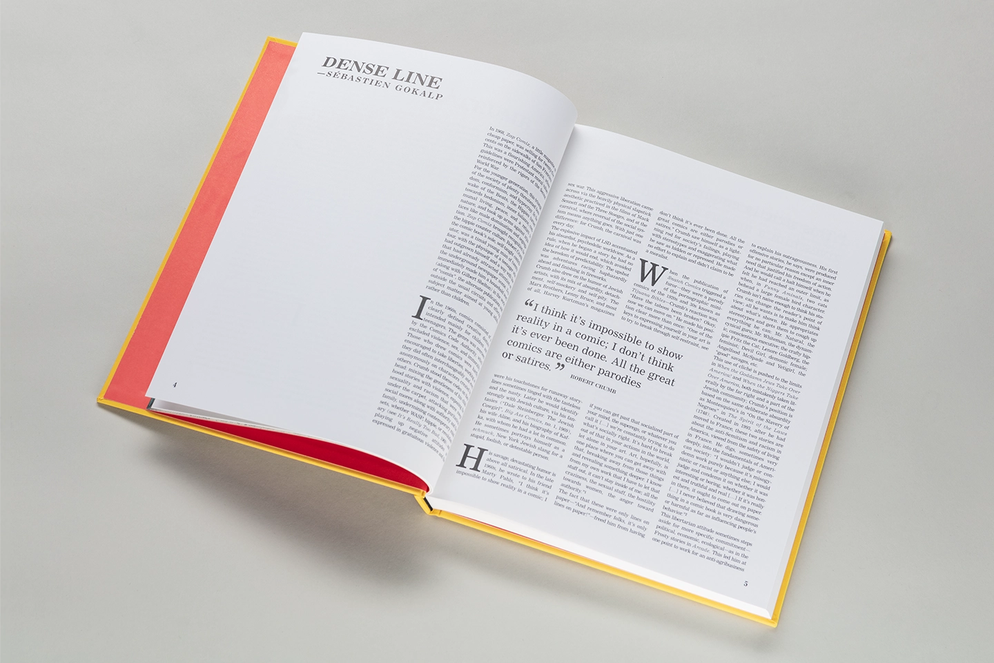
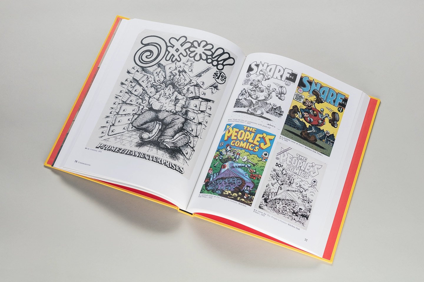
The book design was a revision of the original French edition, but Robert did not want a mere copy, but rather a similar design that would indicate that they are essentially the same book, with some minor additions and modifications. The main task was to adjust the newly translated text, which differed significantly from the original French syntax and word order, and therefore required redoing much of the formatting that Crumb had carefully approved.
Setting type on a book of this size demands meticulous attention to detail, as well as knowledge of the tools available to achieve the desired results quickly and easily. Adding to the difficulties, the original was done in Quark and the new design was to be built in InDesign, so an expert proficiency in both was essential to complete the book on time.
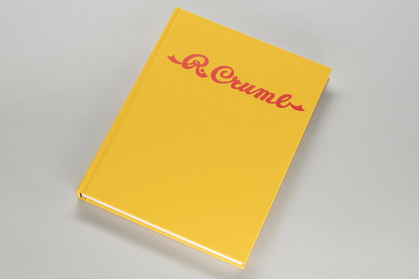
Being familiar with Crumb’s work, I felt that I understood his design aesthetic and tried to create something that would be as timeless as his distinguished career. The result was a minimal cover design that features a solitary hand-lettered signature re-centered prominently on a sea of canary yellow book cloth. The high contrast makes for high readability and visibility, while Crumb’s signature is enough to attract his fans’ attention. The final book has a strong shelf presence and can proudly sit on the shelves of the most discerning collectors.


